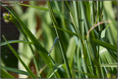
Composition is a crucial component of any shot. Beyond the technical considerations of good exposure etc, it is its composition that determines whether it's a run of the mill snap or a pleasing photographic image. Let's use this image of a tiny Damsel fly taken at some distance in order not to scare it away...

Technically, this shot isn't too bad. The exposure is good, the colour and contrast is strong and there is decent depth of field control. The trouble is this shot is pretty much instantly forgettable, it's subject, the Damsel fly, is small, smack bang in the centre of the frame and lacks impact. You've probably heard that placing the subject of any short in the centre of the frame generally leads to a boring snap. Wouldn't it be great of there was a rule or a formula that could help make that artistic difference? Well there is!
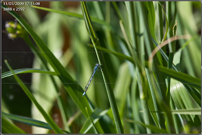
There are a number of tools at the photographers disposal when it comes to improving an image's composition. One most will have heard of is the "rule of thirds", simply stated, the rule of thirds places an imaginary grid over an image where the grid lines divide the scene horizontally and vertically into 9 sections as below.
It just so happens that if the subject of an image is placed on the point these lines cross, a more pleasing composition can be achieved. The rule of thirds is actually an approximation for a better tool based on the amazing "golden ratio", This video gives a great explanation of the ratio and its fascinating properties as does this post.
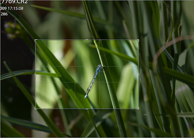
Now using this grid we can crop the image so the Damsel fly occupies more of the frame. In addition we position the key part of the subject on the intersection of the grid lines...
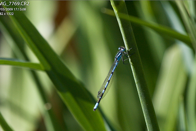
The result is a dramatic improvement in the feel and aesthetics of the shot. The eye is drawn naturally to the head of the insect, the image below seems somehow more natural, more alive, an intimate view of a living secret world.
The Golden ratio grid also works in portrait view as below...
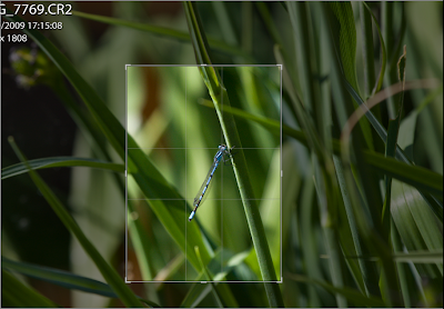
Cropping in this way brings the same sense of life to the image but changes the feeling of scale...
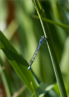
In these examples I've applied this technique by cropping the image in post processing using Adobe Lightroom. Generally I try and get as close to this type of composition as possible when taking the image in the first place. I do this by trying to imagine where the intersection of the grid lines would be in my viewfinder and positioning the subject accordingly at the point I take the shot. Only small adjustments are then required in post processing preserving as much of the original as possible.
The Golden ratio is a powerful tool, try thinking about it next time you look through your viewfinder. If you find the Golden ratio tricky, try the rule of thirds, it's a good approximation, easier to imagine and usually produces good results. If you have a compact camera and use the screen at the back to compose your images, you could even place small marks on the screen marking the intersection points. If you use these techniques you will see a tremendous improvement in the quality of your shots and everyone will want to know how you do it...


